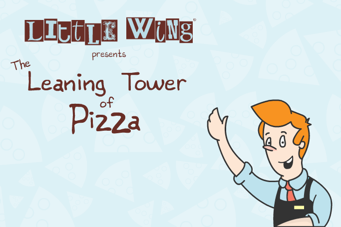
Little Wing Pizzeria
Overview
I was approached by Little Wing Pizzeria to design an app for the business. The client wanted an app would help to get children more involved with the Little Wing brand. The app was to be aimed at 6 to 12 year olds and it had to comply with Little Wing's brand guidelines. In the weeks that followed that initial meeting i began to design what would become The Leaning Tower of Pizza.
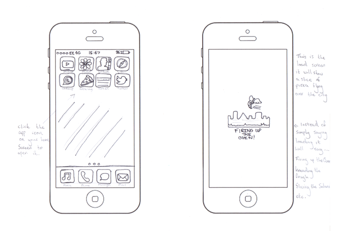
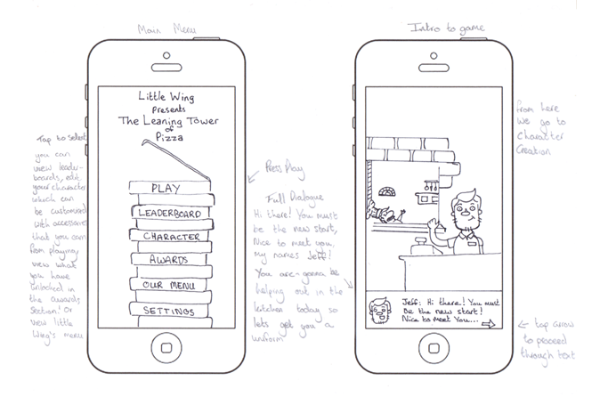
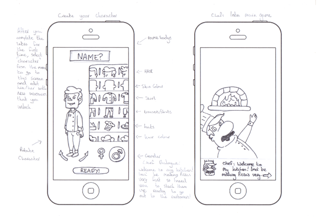
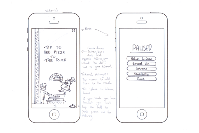
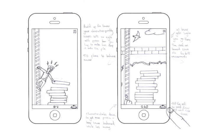
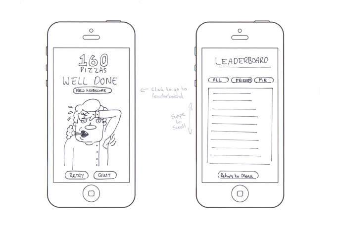
The Leaning Tower of Pizza is a tower building game, designed to be easy to pick up and put down, with no commitments. Pizzas are being made lightning fast in the Little Wing kitchen and you have to stack them up, ready to go out to the customers. The aim is to build the tower as high and as stable as possible to avoid it collapsing, once you feel that your tower has reached its limit, tap the bell and the pizzas will be delivered to the customer...and of course your high score will be saved so you can earn a spot on the leaderboards!
Putting The User First
Following meeting with the client I decided to kick off the project with an initial brainstorming session. This allowed me to get a bunch of ideas out of my brain and onto paper, often taking two completely different ideas and seeing if I could combine them and turn them into something unique. I used this method to forge a rough idea for the app itself, while also looking into competitors and similar apps on the market.
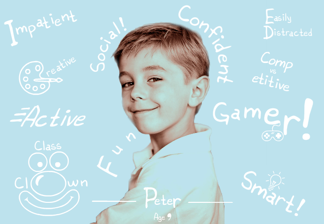
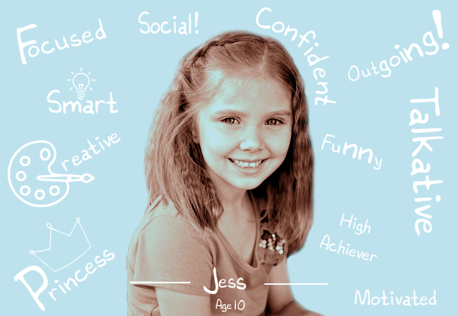
With a rough idea in place I began using quantitative and qualitative research methods such as surveys and focus groups to better understand my users, building user personas and allowing them to inform my design moving forward by adopting an iterative process. This research proved to be invaluable moving forward as I gained an entirely new perspective from not only speaking to my target demographic of children aged 6 to 12, but also from speaking to their parents. I found that parents were not so keen on the idea of their children playing games at the dinner table and so I opted to make the game one that came with no strings attached gameplay, no checkpoints or levels, simply a game that you can pick up and put down at your leisure.
Prototyping
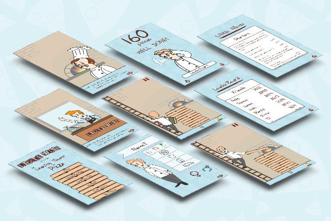
Throughout the design process I created both lo-fi and hi-fi prototypes that I allowed my users to interact with. I was able to observe these interactions and used the feedback that I received to better refine the design. I began by storyboarding the app from start to finish on paper and creating a very rough InVision prototype, before creating a more robust InVision prototype that more closely resembled the final design. After all of this iteration I was able to put together a detailed Principle prototype as a proof of concept to present to the guys at Little Wing.
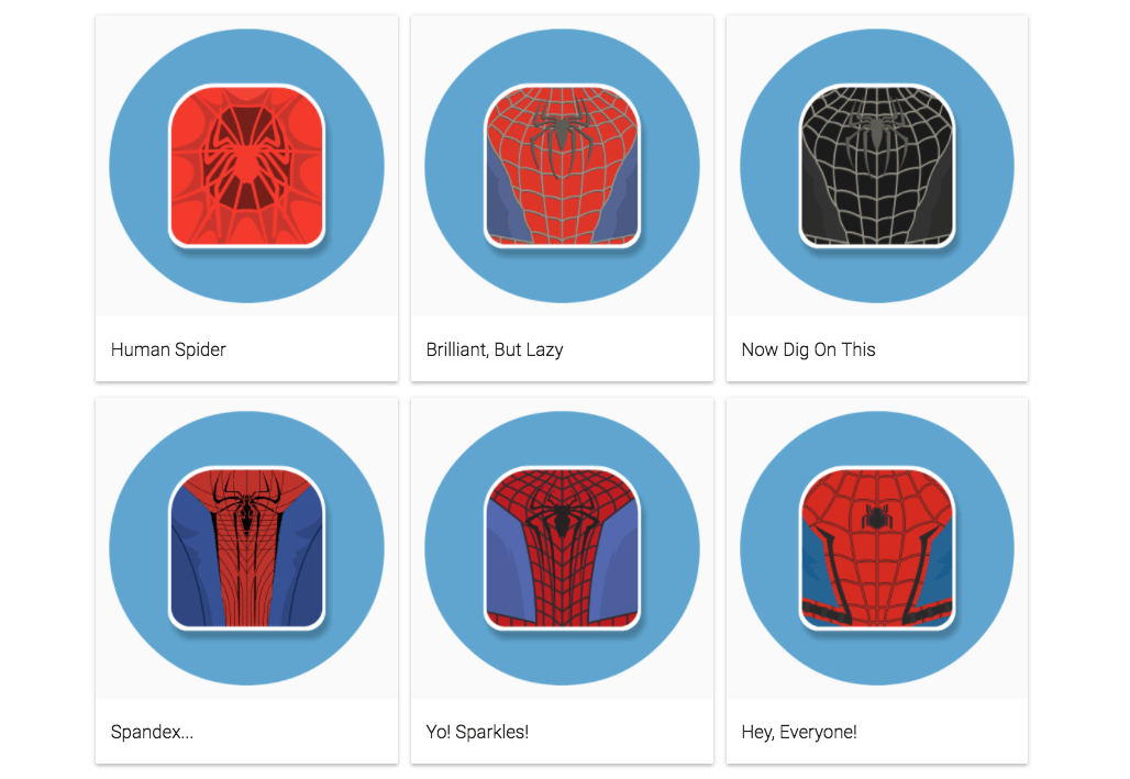
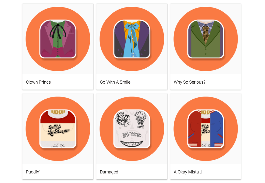
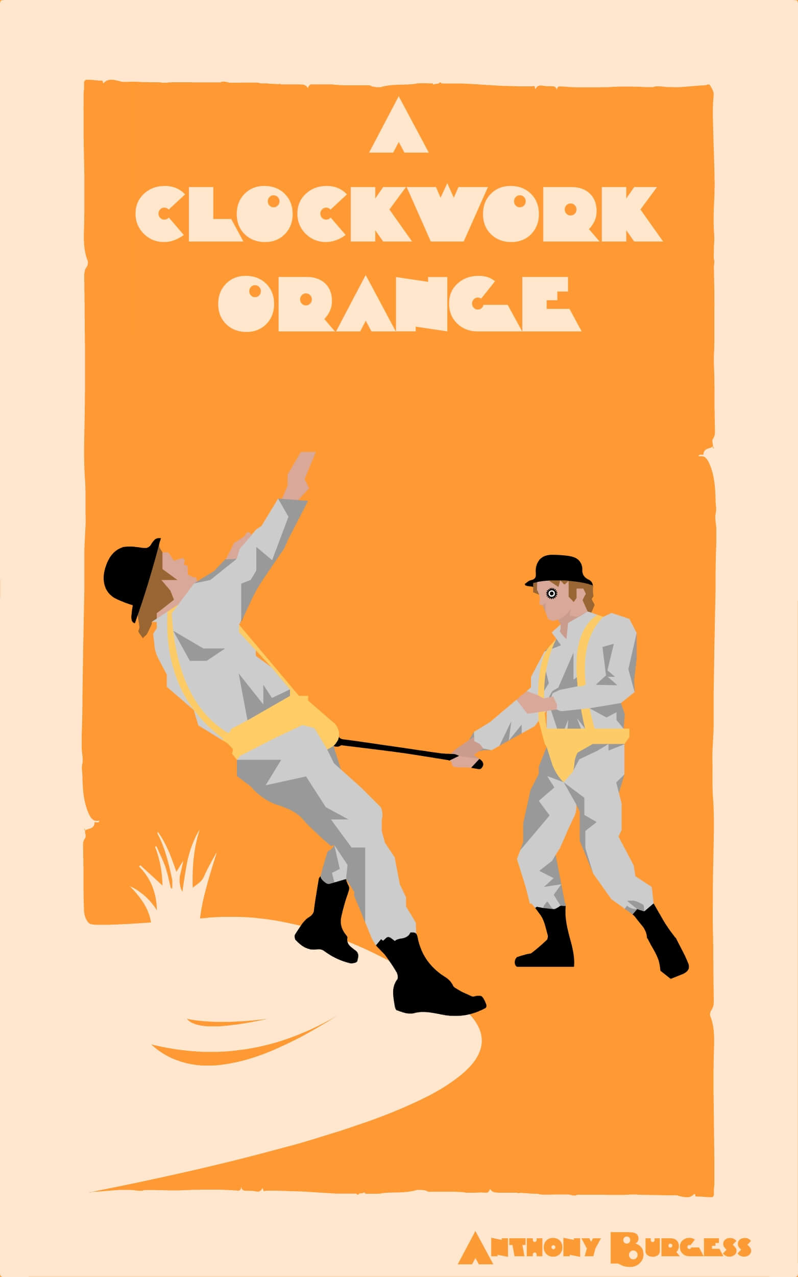
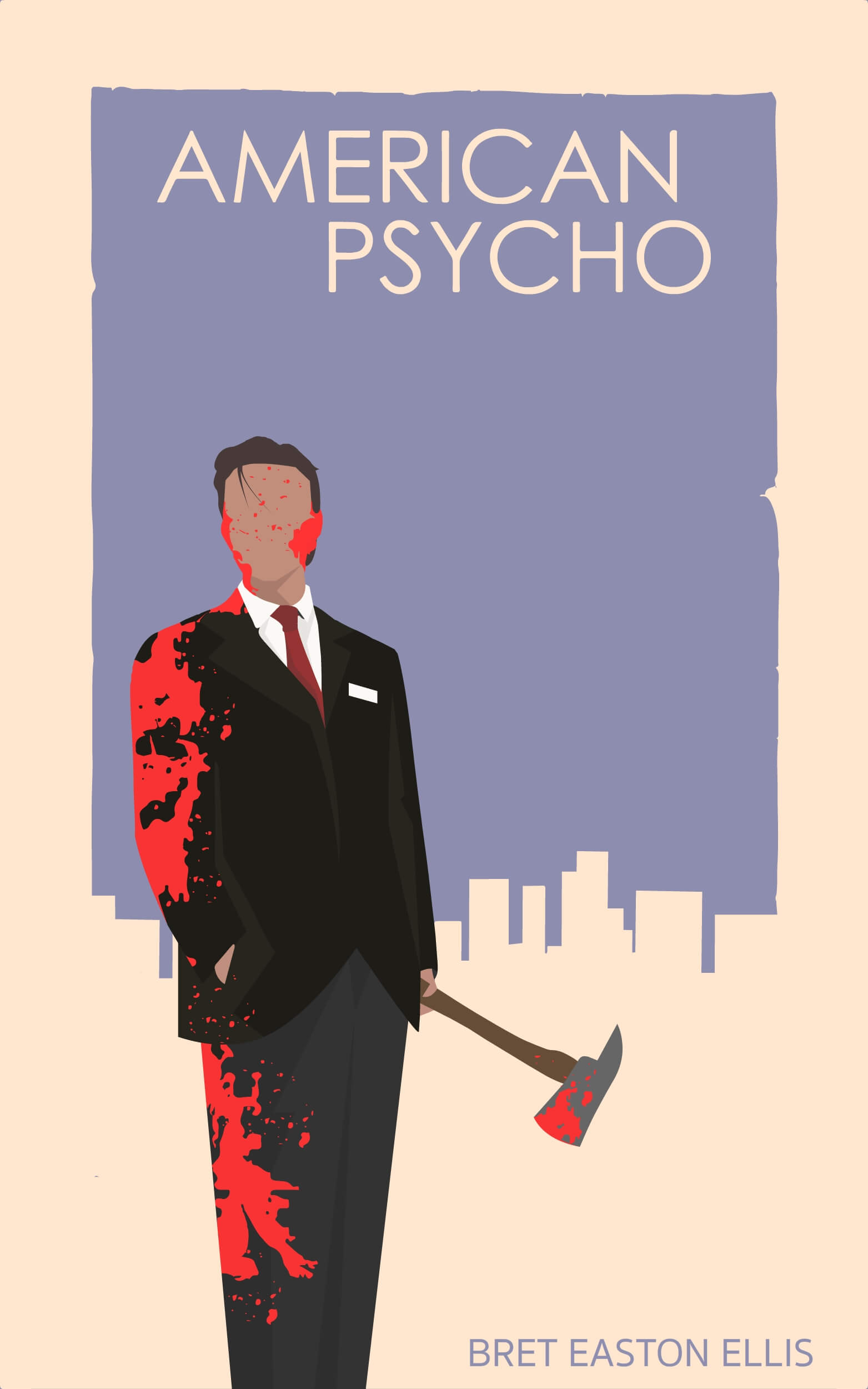
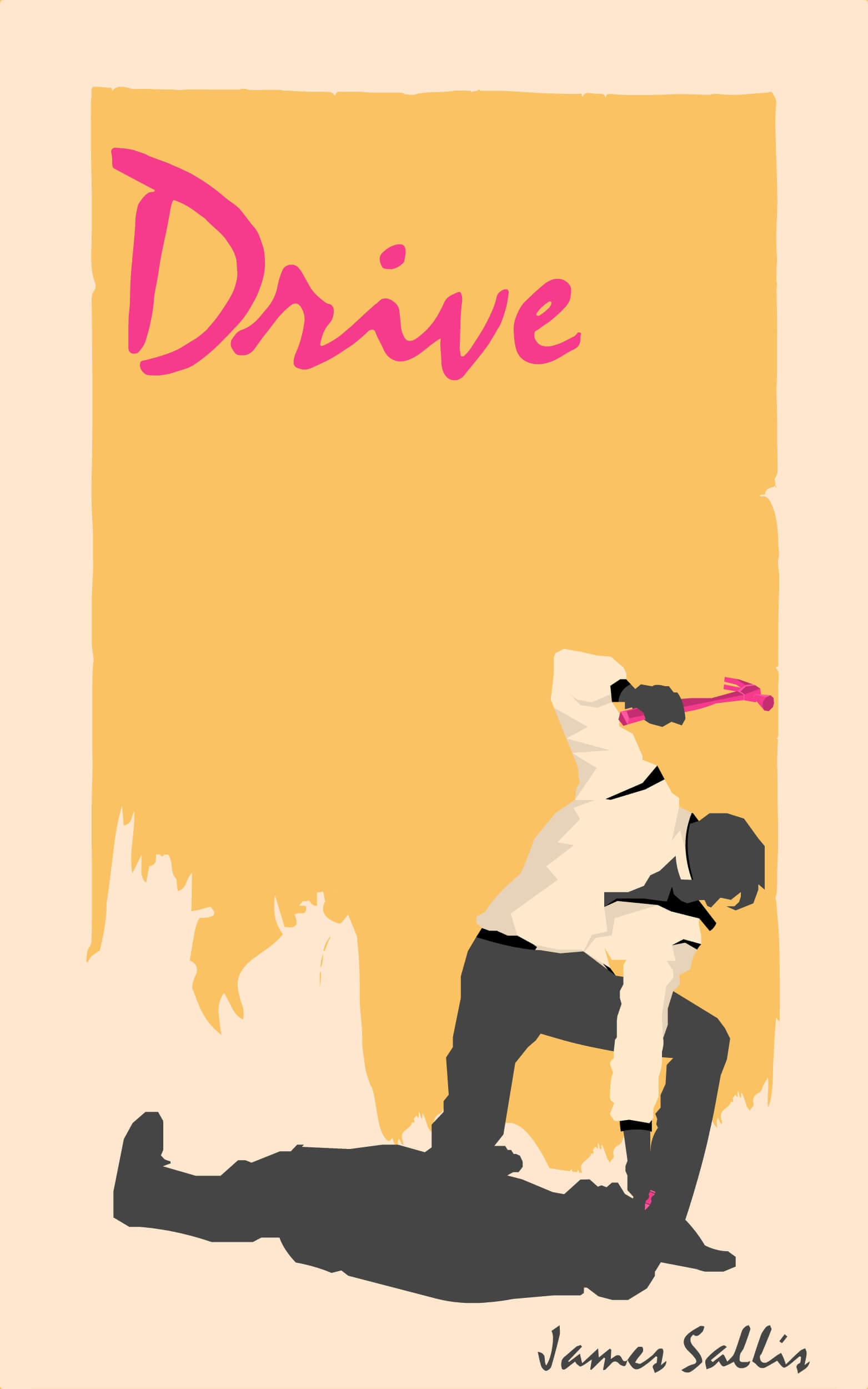
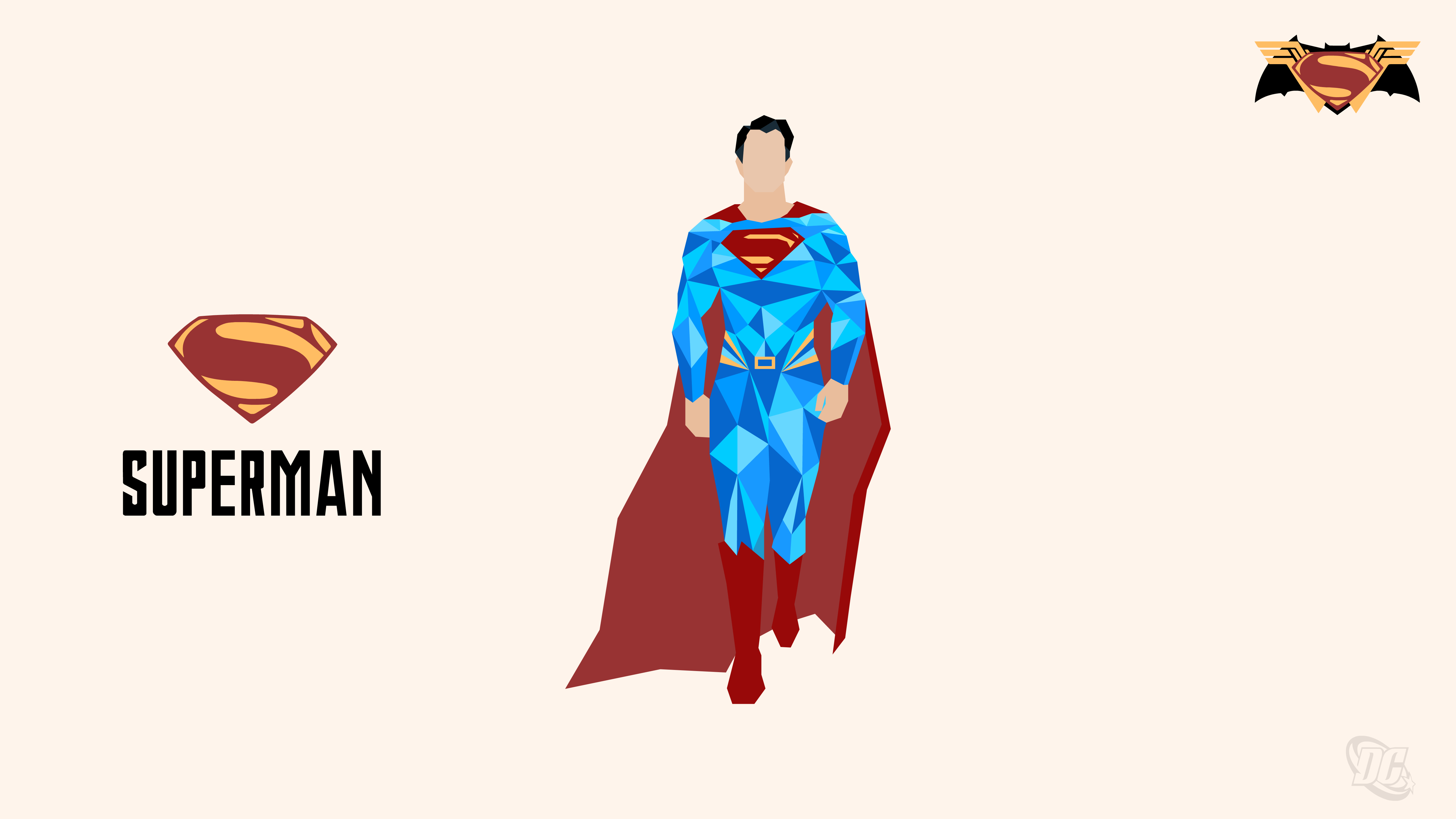
COMiCONS
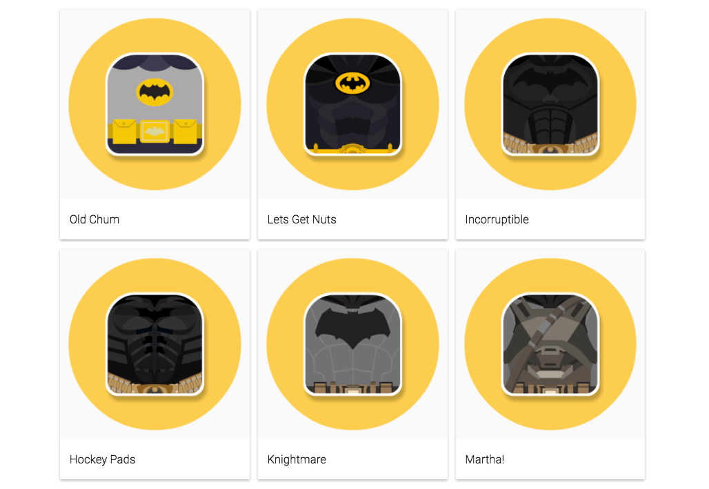
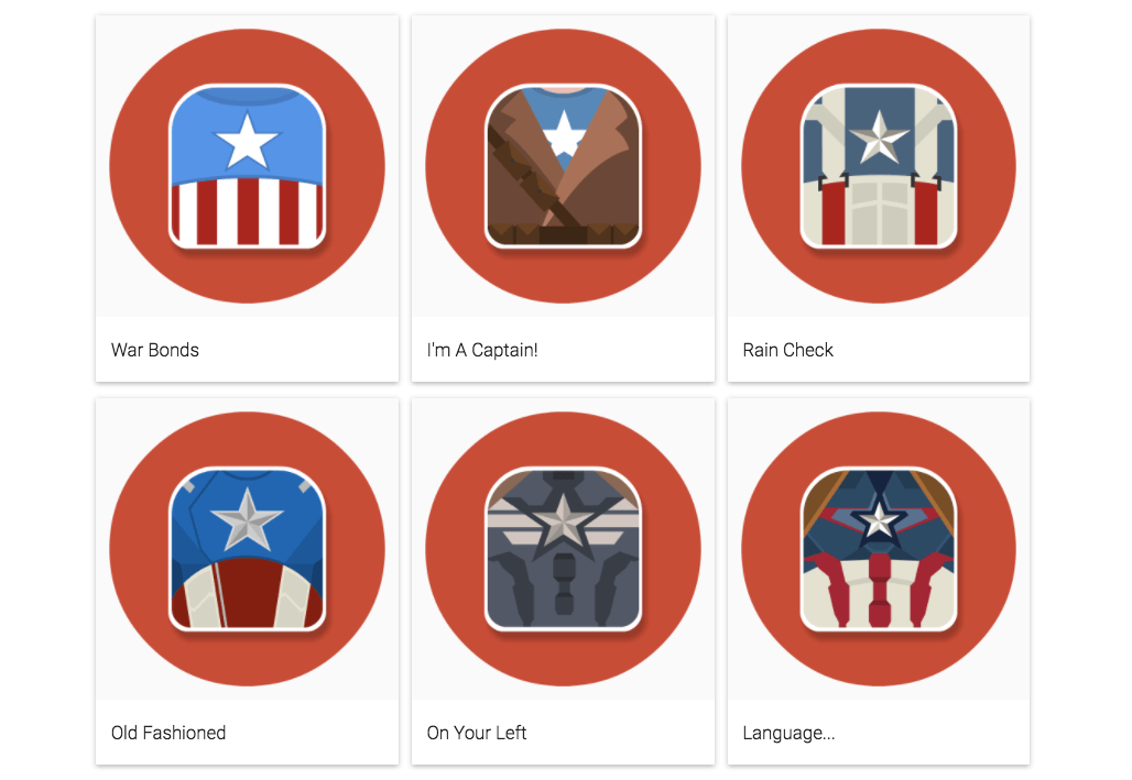
I have always loved comic books, so naturally when I was given an open brief for an icon set I decided to theme it around favourite heroes and villains. With comic book films and TV shows being so prevalent I thought that it would be fun to take a handful of characters and create icons that highlight how their onscreen costumes have changed throughout the years, from TV to film.
I made the decision to focus purely on the torso of each character in order to get the most detail in my icons and, in the Joker’s case, show how the clothing that the character wears can be just as recognisable as his psychotic smile and green hair.
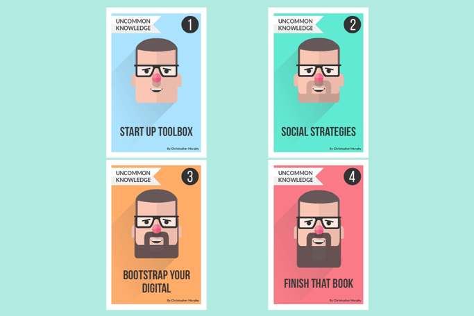
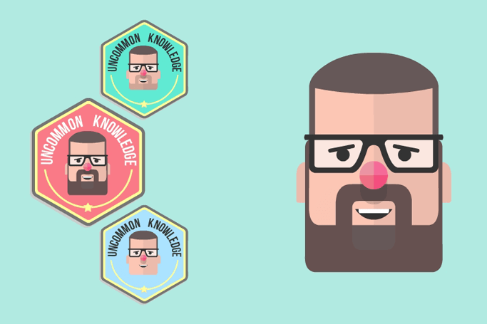
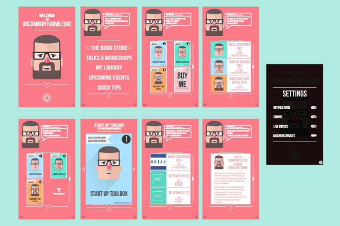
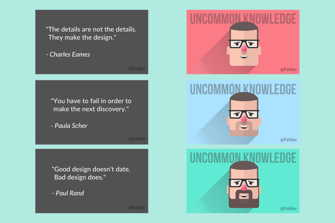
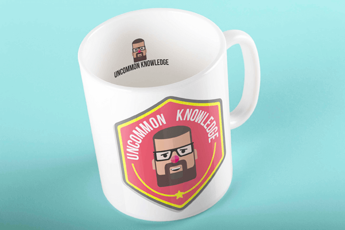
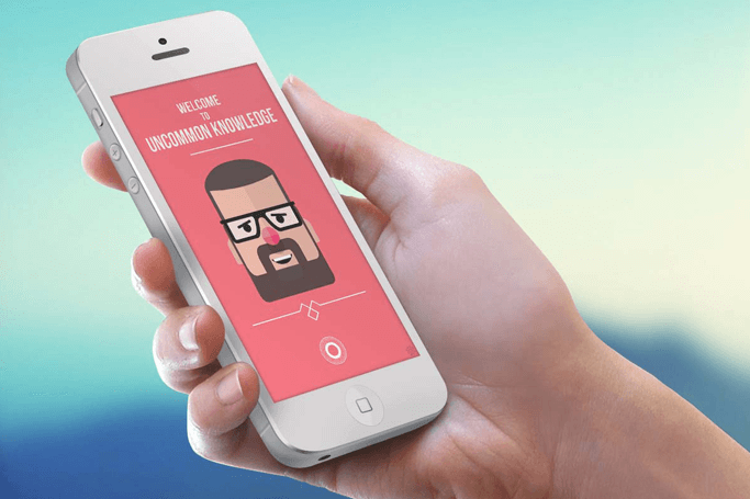
Uncommon Knowledge
I was tasked with creating a brand for Christopher Murphy’s proposed series of workshops and accompanying books, Uncommon Knowledge. The brief called for a consistent brand as well as touch points and so I looked at a variety of competitors whilst doing my research for the project, with the aim of finding a way to set Uncommon Knowledge apart, to make it both accessible and eye catching.
As the project developed, the scope of Uncommon Knowledge shifted, focusing less on workshops that people would physically attend and more on online classes and video tutorials. This gave me the opportunity to design the Uncommon App, a hub for everything Uncommon Knowledge. The App would not only be home to the tutorials themselves but also allow you to purchase and read the accompanying books.
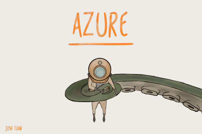
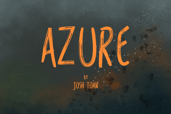
Azure
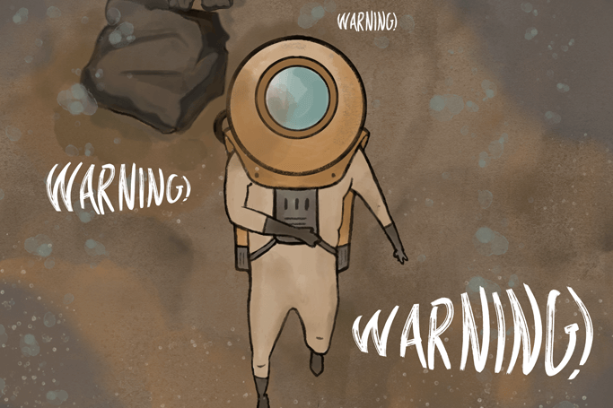
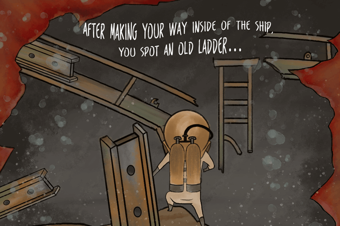
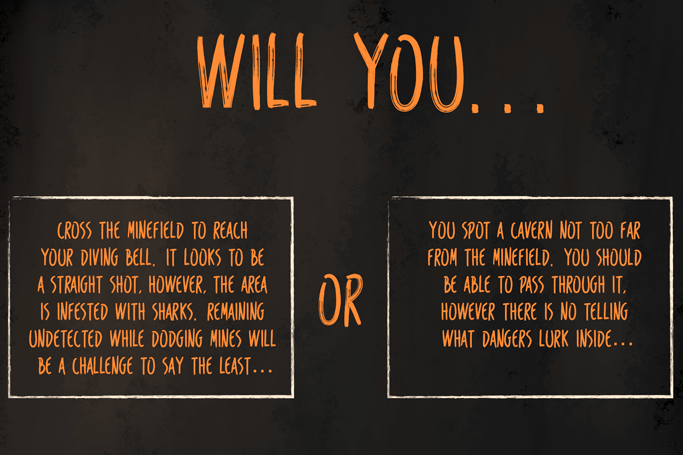
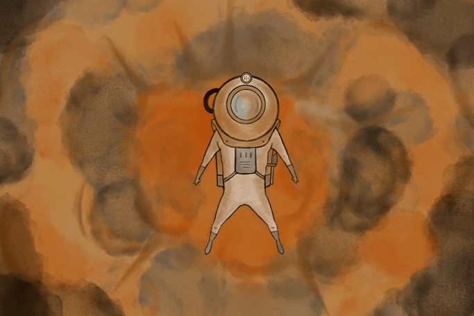
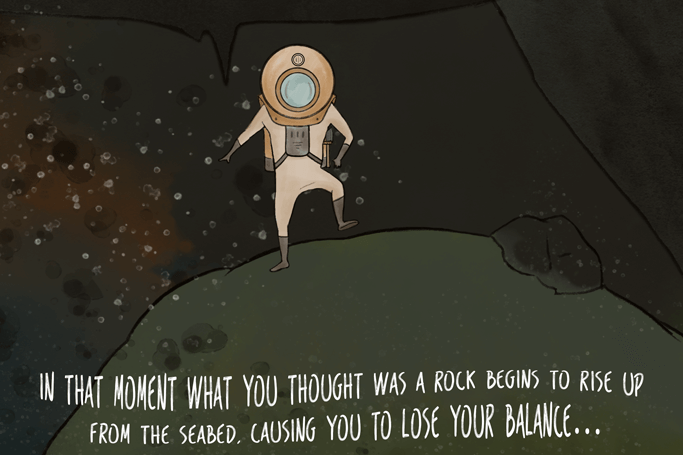
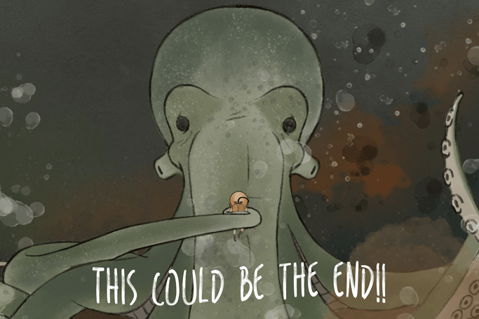
Azure is an undersea adventure that is modelled on the popular Choose Your Own Adventure series of books from the late 70s and 80s. The story sees the reader take on the role of The Diver who has been separated from their crew, the reader must therefore make a number of choices in order to overcome the dangers that lie in the oceans depths and be reunited with their crew.
I began the process by planning out how the book would unfold, no small task when crafting a book with multiple paths and endings, from here a created storyboards and both paper and digital prototypes. I am proud to say that I was able to use my graphics tablet along with Adobe Photoshop to complete just short of 70 fully illustrated pages to form my first book, Azure.
Get in Touch
Am I the Droid you're looking for? Don't hesitate to get in touch!
contact@joshtoan.com